What are the best colour palette ideas for Indian homes?
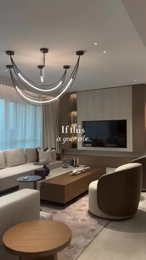
The most reliable colour palette ideas for Indian homes start with a warm neutral base (warm white, greige, sand or ivory), add one grounding mid-tone (sage, terracotta, teal or taupe), and finish with a small dose of a rich accent colour through fabrics, art or a single feature wall. This 60-30-10 approach works in both compact flats and large kothis.
Indian homes face unique conditions: intense afternoon sun, dust, children and elders sharing the same spaces, and a love of colour in festivals and textiles. Very stark whites can look cold under our light and show every mark; very dark walls can make small rooms feel heavy. Warm, slightly muted colours are forgiving and age gracefully.
The 60-30-10 rule: roughly 60% of the room in the base colour (walls, large surfaces), 30% in a secondary colour (furniture, curtains, a panelled wall) and 10% in an accent (cushions, art, a vase, a statement chair).
Eight colour palettes that work in Indian homes
Choose a palette that matches the mood you want, then adapt its intensity to your room size and light.
| Palette | Base | Secondary | Accent | Best for |
|---|---|---|---|---|
| Quiet luxury | Ivory | Mushroom taupe | Brushed brass | Living, master bedroom |
| Earthy modern | Sand beige | Terracotta | Olive green | Living, dining |
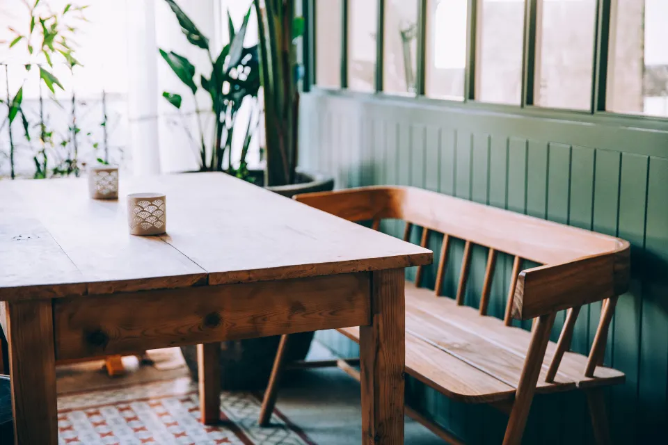
| Garden calm | Warm white | Sage green | Natural cane and oak | Bedroom, dining, balcony |
| Coastal soft | Off-white | Dusty blue | Sandy rattan | Kids room, guest room |
| Royal classic | Cream | Deep teal or emerald | Gold and mustard | Formal living, dining |
| Nordic warm | Greige | Light oak | Charcoal | Small flats, study |
| Heritage warm | Ivory | Walnut wood | Rust and indigo textiles | Kothis, traditional homes |
| Serene devotional | Pure warm white | Pale gold or champagne | Soft saffron | Pooja room, foyer |
These palettes also align well with current trends; our roundup of interior decoration design trends shows how warm neutrals and textured finishes are replacing the all-grey look.
Wall colour combinations for each room
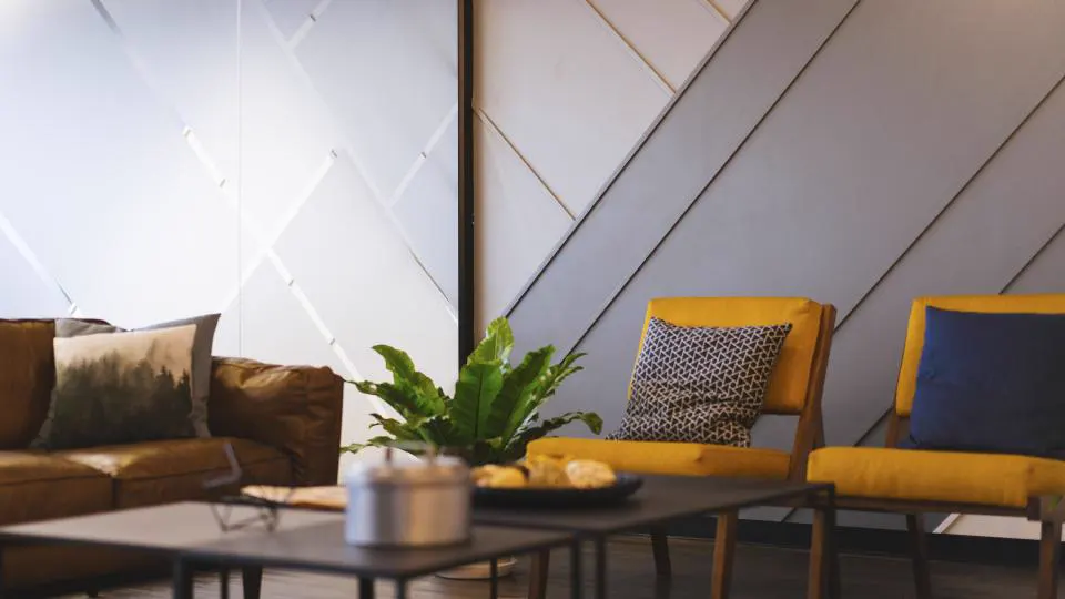
Use calmer, warmer combinations in bedrooms, slightly bolder ones in living and dining spaces, and light, easy-to-clean shades in kitchens and kids rooms.
Living room
- Greige walls with a sage green panelled TV wall.
- Warm white walls with a terracotta or rust accent wall behind the sofa.
- Ivory with a deep teal feature wall and brass accents for a formal look.
For furniture and décor that complement these, see living room decor ideas for Indian homes.
Bedroom
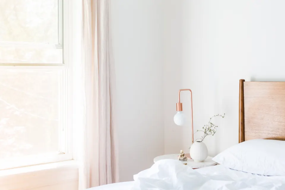
- Soft taupe walls with a mushroom upholstered headboard.
- Pale blue-grey with white trims for a restful guest room.
- Dusty rose with warm wood for a cosy master bedroom.
Kitchen
- White or cream walls with sage or navy lower cabinets.
- Light grey walls with warm wood-grain upper shutters.
- Choose a washable, stain-resistant paint near the cooking zone, or extend the backsplash tiles.
Kids room
- Soft mint or powder blue with one playful accent wall or mural.
- Neutral base with colour brought in through storage shutters, which is easier to change as the child grows.
Dining
- Warm white with an olive or forest green panelled wall.
- Beige with a textured ochre accent for warmth under pendant light.
Pooja room
- White or ivory with champagne gold details and a backlit jaali or lotus panel.
How does sunlight change your wall colours?
North-facing rooms get cooler, softer light, so warm colours look best there; south- and west-facing rooms get strong, warm light, so cooler or muted tones keep them from feeling hot. Always check swatches at morning, afternoon and night.
- North light: choose warm whites, creams and warm greys; cool greys may look bluish and dull.
- South and west light: sage, grey-green, soft blues and stone tones stay calm in harsh afternoon sun.
- East light: most colours work; morning light is bright and fresh.
- Artificial light: 2700K to 3000K warm LEDs push colours warmer. Test paint samples under your planned lighting, which our home lighting design guide covers in detail.
Paint A4-sized or larger swatches on two walls of the room and observe them over two days before deciding. Small paper chips are misleading.
Choosing paint finishes and textures
Use matte or low-sheen emulsion on living and bedroom walls, satin or washable finishes in kitchens, kids rooms and passages, and reserve high-gloss for small accents or wood and metal surfaces.
| Finish | Look | Where to use | Watch out for |
|---|---|---|---|
| Matte | Soft, velvety, hides wall flaws | Living rooms, bedrooms, ceilings | Choose a washable matte in family homes |
| Satin / eggshell | Gentle sheen, easy to wipe | Kids rooms, passages, dining | Shows uneven putty work |
| Gloss | Reflective, durable | Doors, trims, grills | Highlights every dent |
| Texture / limewash | Depth and movement | Feature walls, staircases, pooja rooms | Needs skilled application |
| Anti-fungal exterior grade | Weather protection | Balconies, exposed walls | Surface preparation matters |
Textured walls, microcement effects and limewash finishes have become popular for staircases and feature walls because they add depth without adding more colours. They pair beautifully with wall panelling and decor.
Bringing colour in without painting walls
If you rent, or prefer calm walls, introduce colour through joinery, upholstery and soft furnishings instead. These layers are easier to change later and often have more impact than paint.
- Kitchen and wardrobe shutters: sage, navy, dusty pink or olive laminates and PU finishes are a durable way to add colour. Pair a coloured lower run with light upper cabinets so the kitchen does not feel boxed in.
- Upholstery: a single velvet armchair in emerald or rust can anchor an entire neutral living room.
- Curtains and rugs: large surfaces that shift the mood of a room in an afternoon. Our home furnishing guide covers fabrics and sizes.
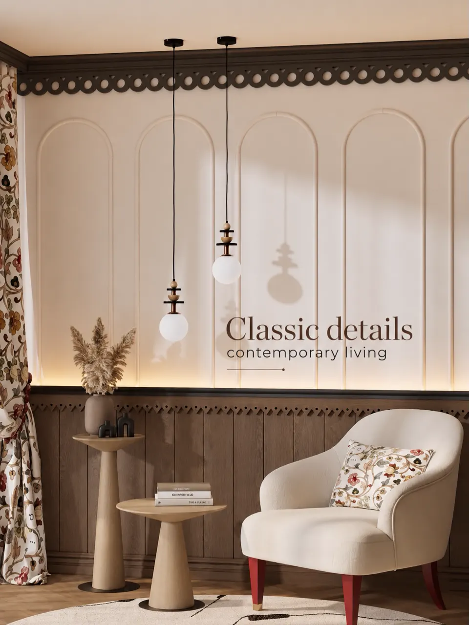
- Art and textiles: block prints, dhurries, Kantha throws and brass accents bring in traditional Indian colour without dating the walls.
- Tiles: patterned floor tiles in a balcony or a coloured backsplash give contained bursts of colour.
A useful test: if you would get tired of a colour in two years, keep it to accessories. If you would still love it in ten, it can go on the walls or joinery.
Mistakes to avoid when picking home colours
- Choosing from a shade card alone. Colours look far more saturated on a full wall.
- Too many accent walls. One per room, or none, is usually enough.
- Ignoring fixed finishes. Flooring, kitchen shutters, wardrobe laminates and upholstery should all be considered together. Match undertones: yellow-based marble looks off beside blue-based greys.
- Stark cool white everywhere. It can look hospital-like under Indian light and shows dust quickly.
- Very dark colours in small rooms without good light. Use dark tones on one wall or in joinery instead.
- Different whites in every room. Pick one white for ceilings and trims throughout the home for continuity.
- Skipping primer and putty. Even the best paint looks patchy on a poorly prepared wall.
Building a whole-home colour story
Create flow by keeping one base colour consistent across connected spaces, then varying the secondary and accent colours room by room. This makes a flat feel larger and a kothi feel cohesive.
- Pick your base neutral for the living, dining and passage areas.
- Choose one wood tone and one metal finish for the whole home.
- Assign a secondary colour to each private room: sage for the master, soft blue for the kids, warm rose for the guest room.
- Carry a thread of the accent colour between rooms through cushions, art or a rug.
- Check the palette in the 3D render before painting, then confirm with on-site samples.
Colour is also one of the most budget-friendly upgrades, which is why it features heavily in our budget home makeover ideas. If you would like a designer to build a palette around your existing furniture and flooring, call Asaya Interiors on +91 98001 08800 and book a colour and material consultation.
Frequently asked questions
Which colour is best for a living room in an Indian home?
Warm neutrals such as greige, sand, ivory and warm white are the safest base because they suit strong sunlight and most furniture. Add depth with a sage, teal or terracotta accent wall and bring in bolder colour through cushions and art.
What are good two-colour wall combinations for a bedroom?
Popular combinations include taupe with ivory, sage green with warm white, dusty blue with off-white and blush pink with beige. Use the deeper colour behind the headboard and keep the other walls lighter.
Is white a good colour for Indian homes?
White works well if you choose a warm white rather than a stark cool white, and use a washable finish. Warm whites look softer under Indian daylight and warm LEDs, and they are easier to live with in dusty conditions.
How do I choose colours for a small flat?
Keep walls light and consistent across connected rooms, use one colour for ceilings and trims, and add colour through furniture and textiles. Light, warm tones reflect more daylight and make compact rooms feel larger.
Should wall colours match the furniture?
They should complement it rather than match exactly. Check the undertones of your flooring, wood and upholstery, and choose wall colours with the same warm or cool undertone so the room feels cohesive.